SELECTED WORK
Stronger Together. Always!
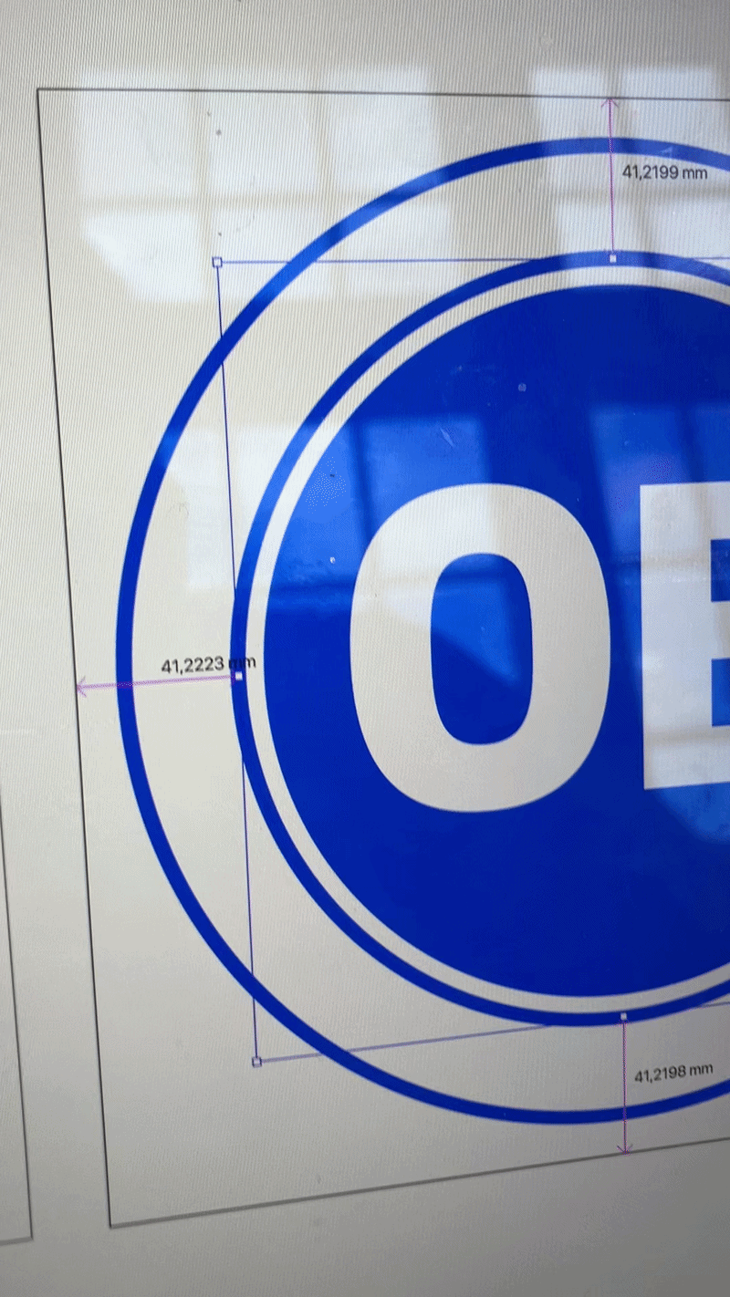
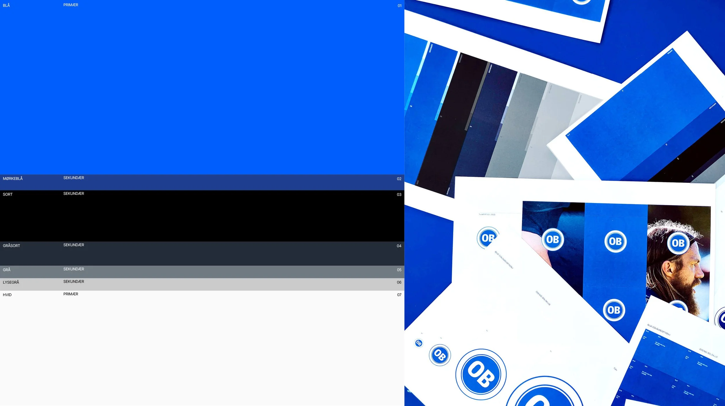
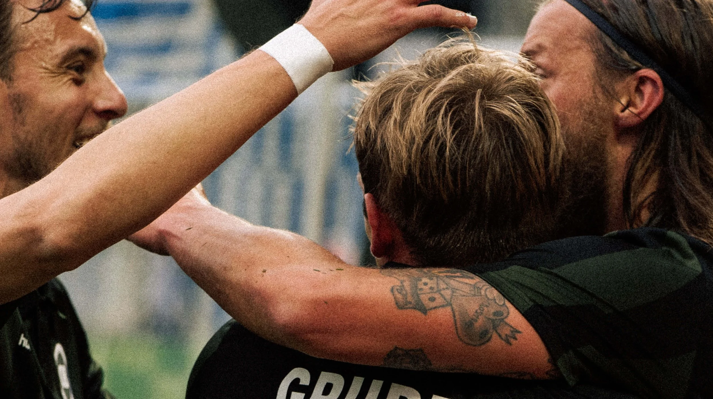
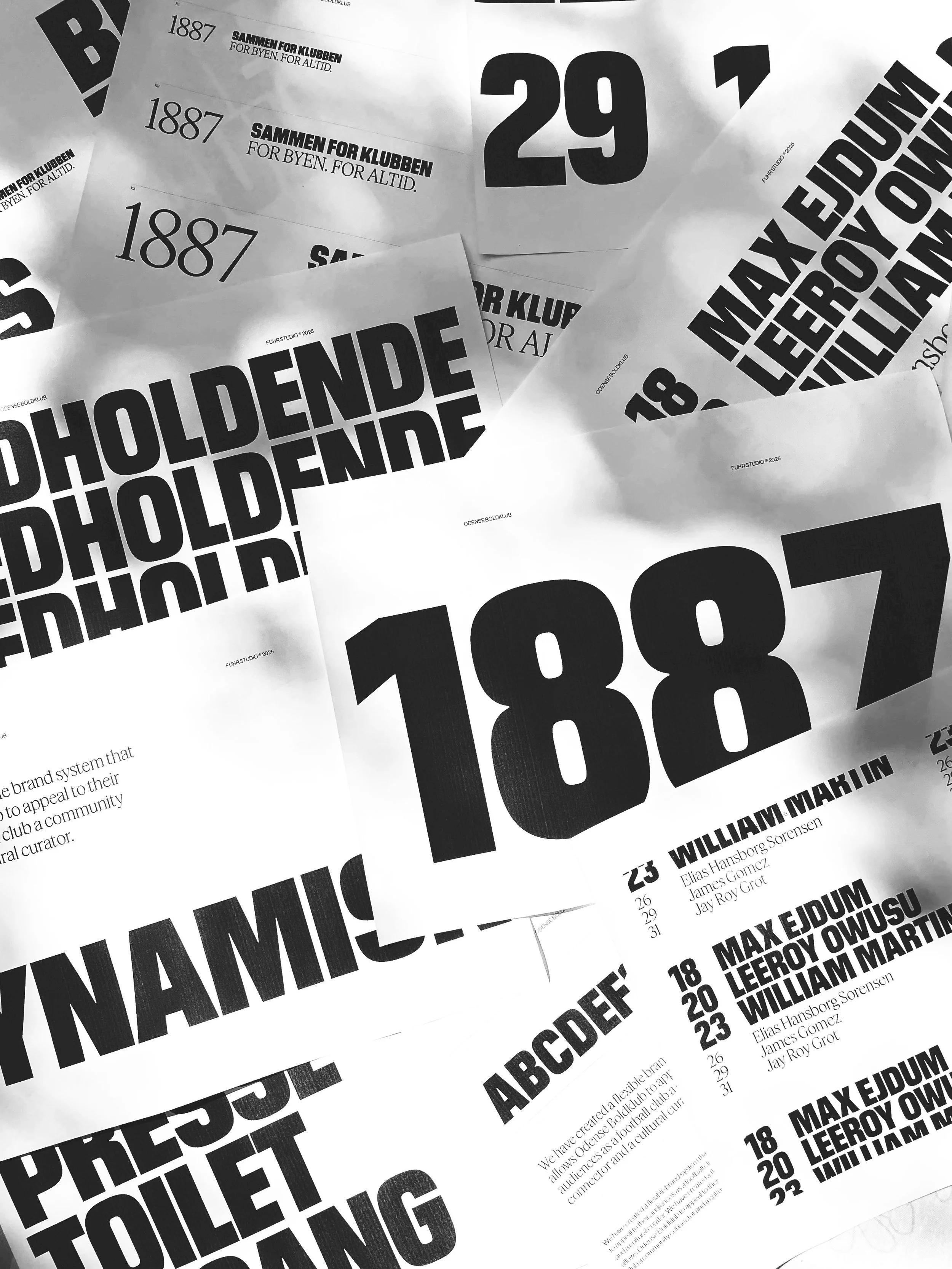
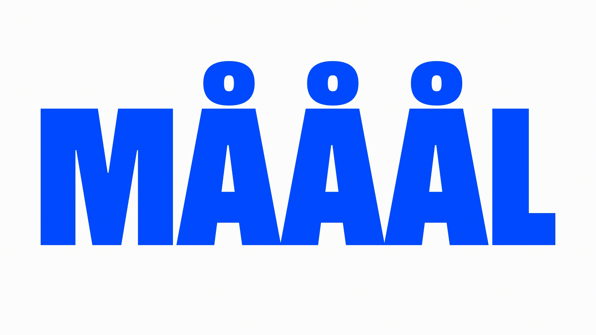
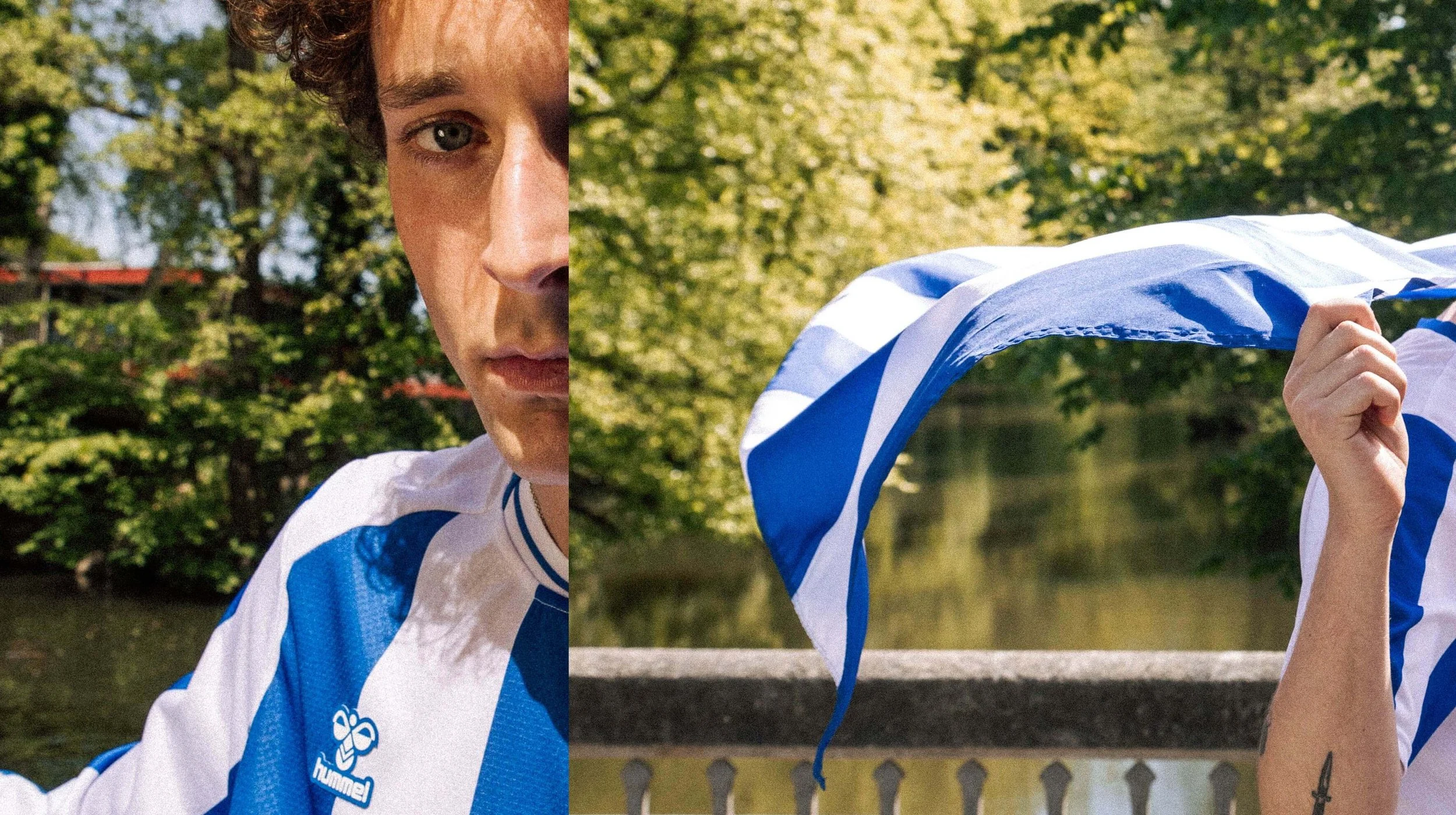
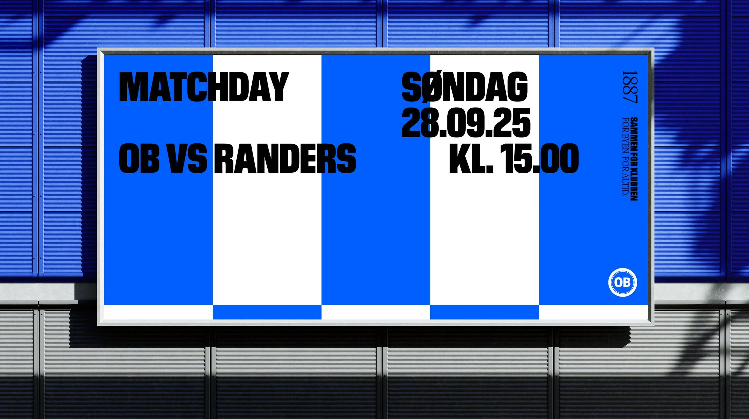
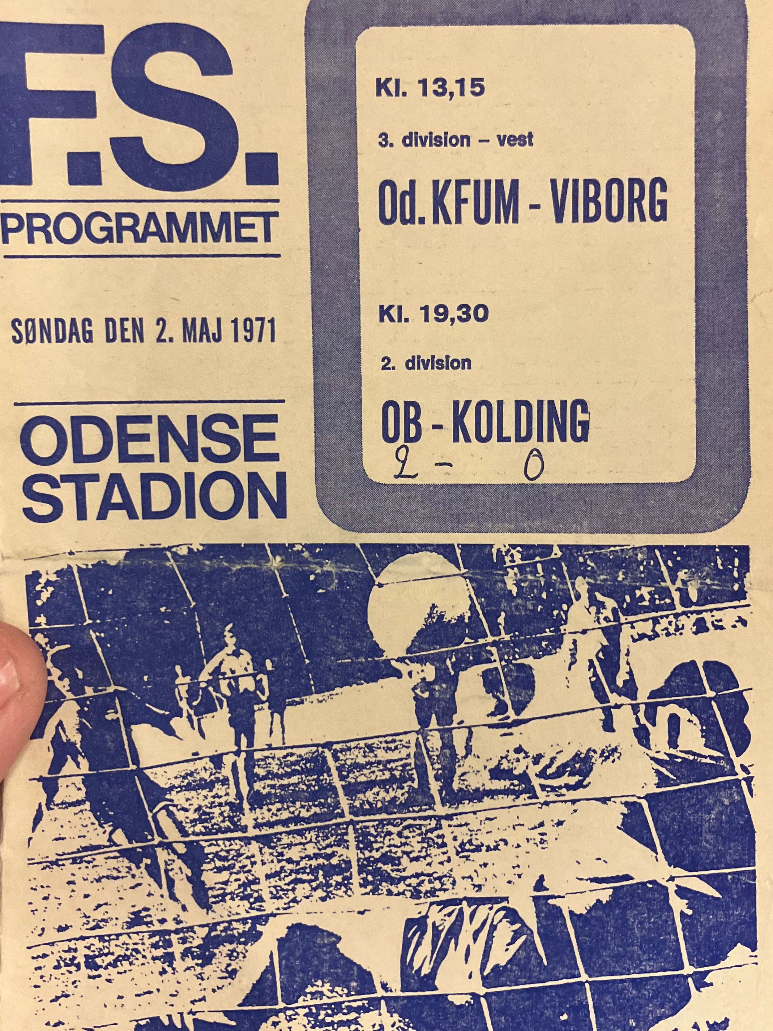
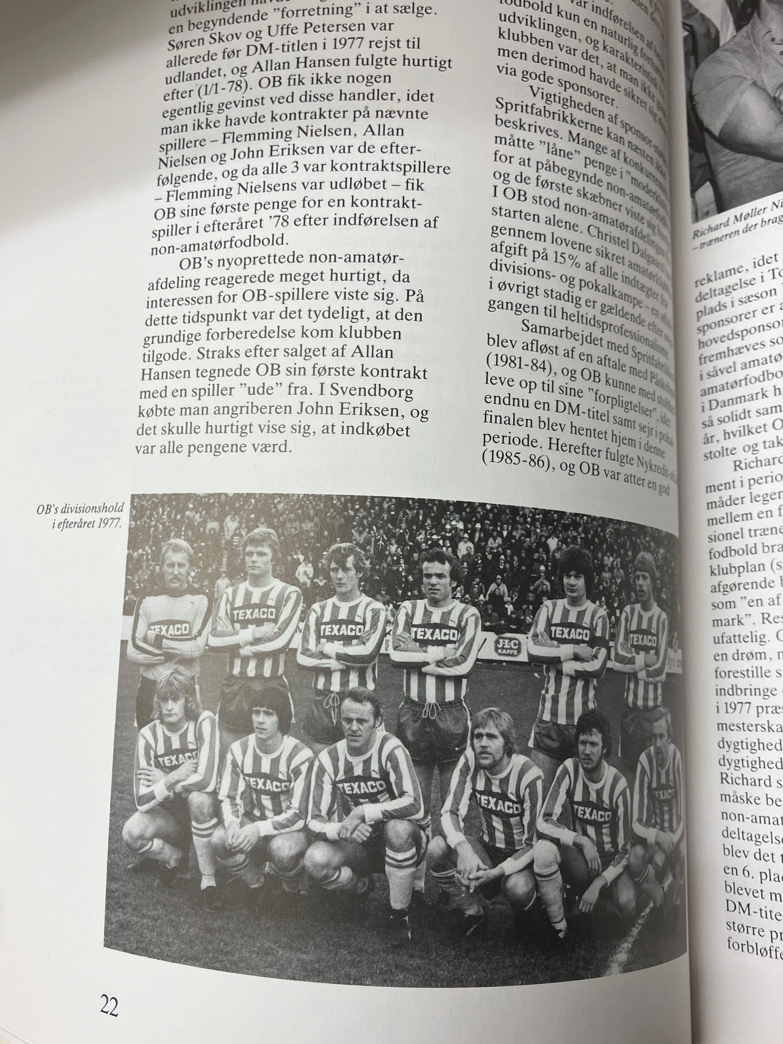
( 2025 ) Odense Boldklub is a living cultural institution with deep roots in the heart of the city and in the community of Funen. Since 1887, we have worn the blue and white stripes with pride. They are not just colors, but a shared language, an identity we reflect in - across generations, neighborhoods, and backgrounds. From street corners to the pitch, from fans to legends, from bricks to goals, something bigger emerges: a sense of belonging. This is community. This is tradition. This is OB. Fuhr Studio has created a brand strategy and visual identity that celebrates the origin of it all: football as a passionate, romantic, and devoted affair. Football is a matter of the heart. The task was to set the direction, modernize, and at the same time future-proof the traditional OB within a dynamic, flexible design system that enhances OB’s appeal to both existing and new audiences, from local to international. As a football club, as a community, as a cultural institution of the pitch. Core values in the work have been community, tradition, cohesion, presence, passion, and power.
Brand strategy
Visual identity
Designsystem
Brand guidelines
Motion Design
Posters
Stationary
Merchandise
SoMe
Photos:
Nicolai Løvgret
Kent Rasmussen


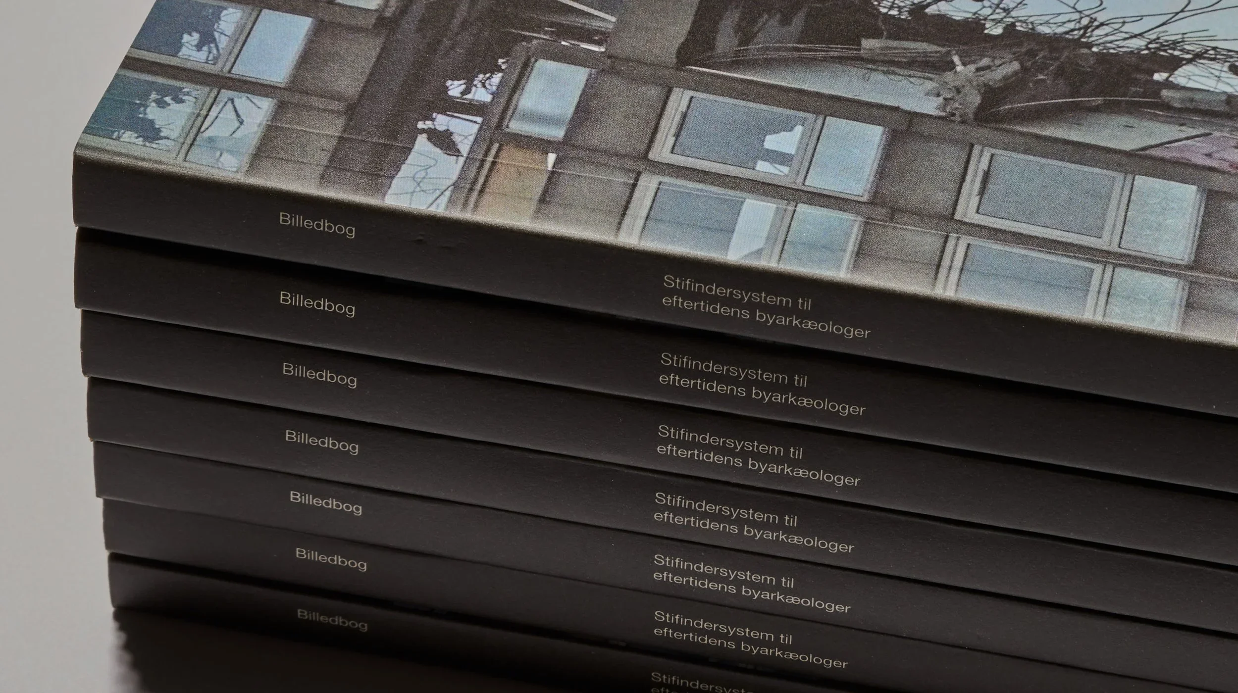
A wayfinding system for the city archaeologists of the future
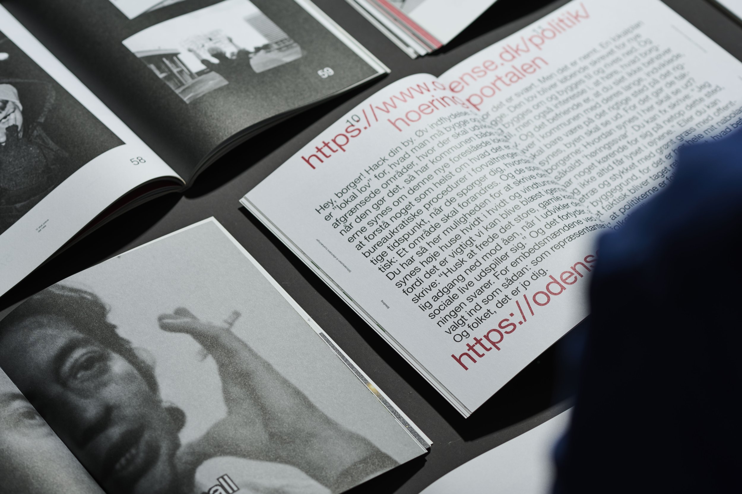
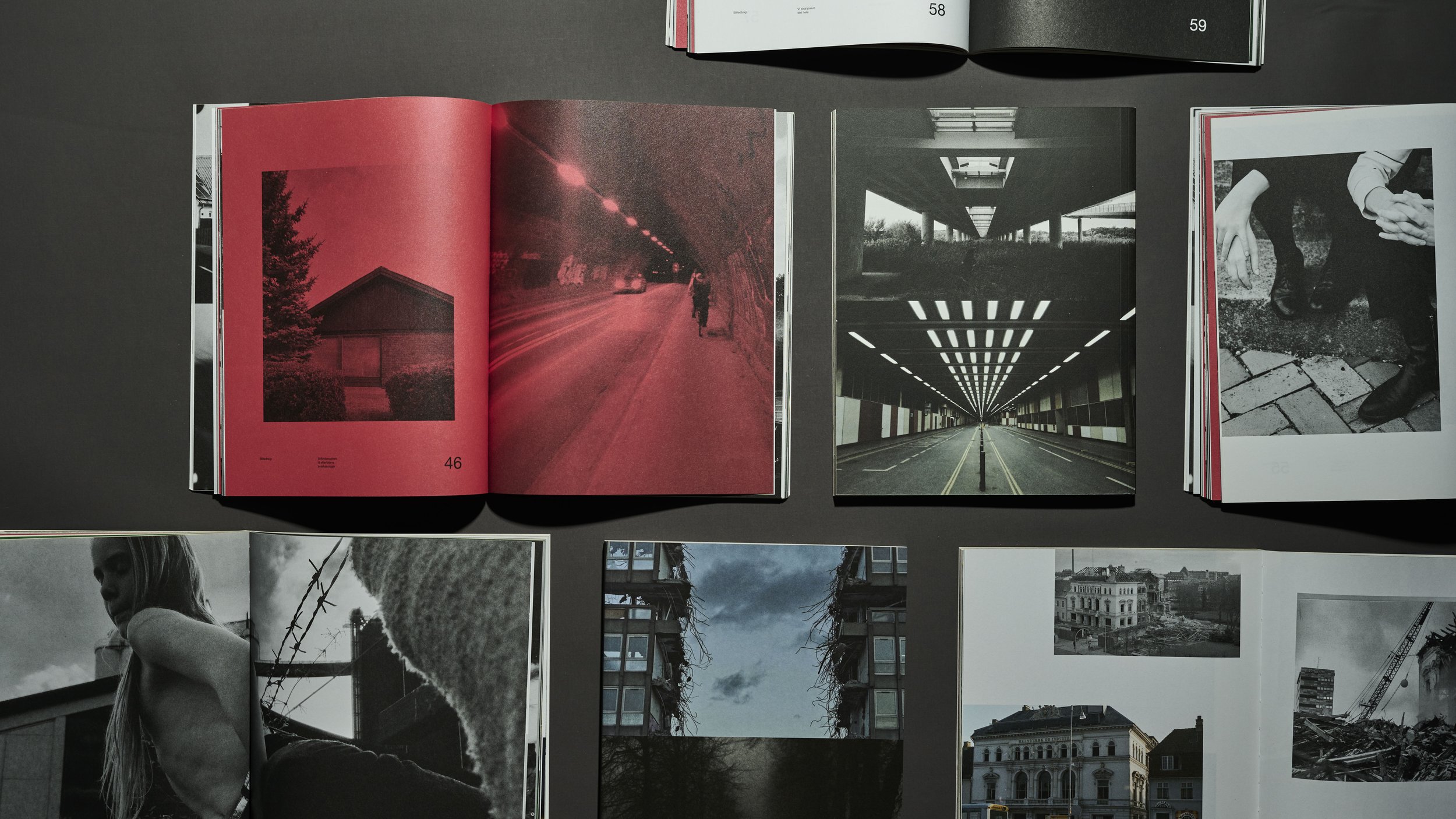
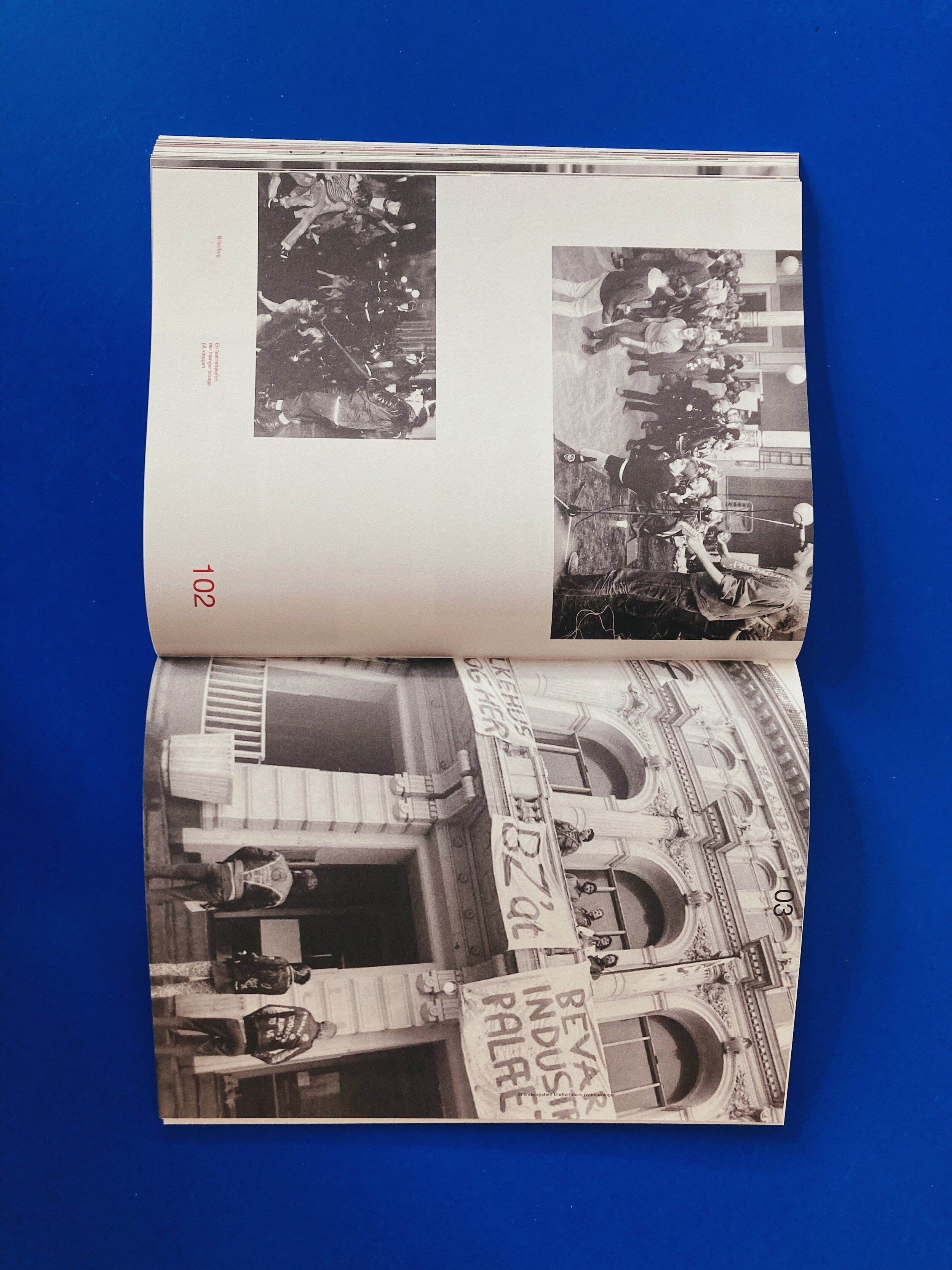
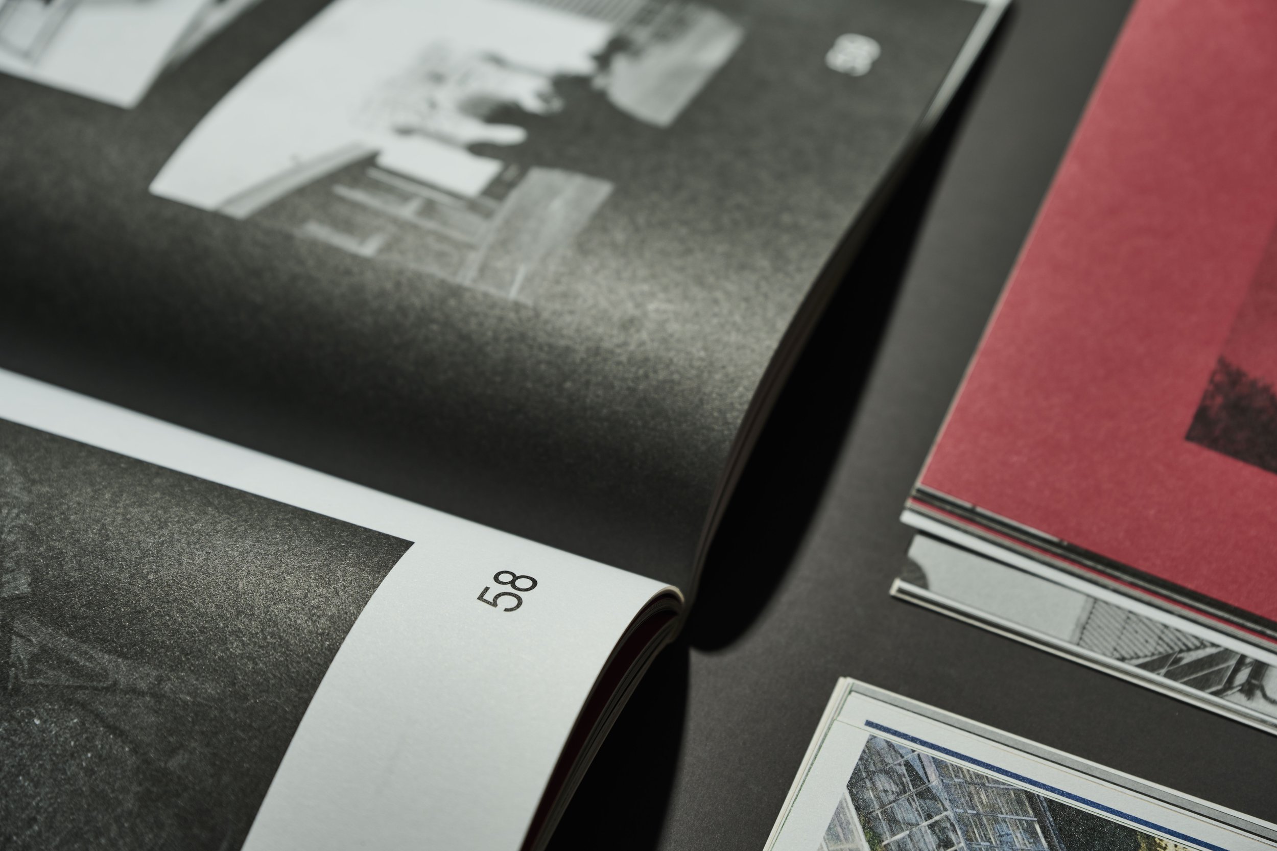
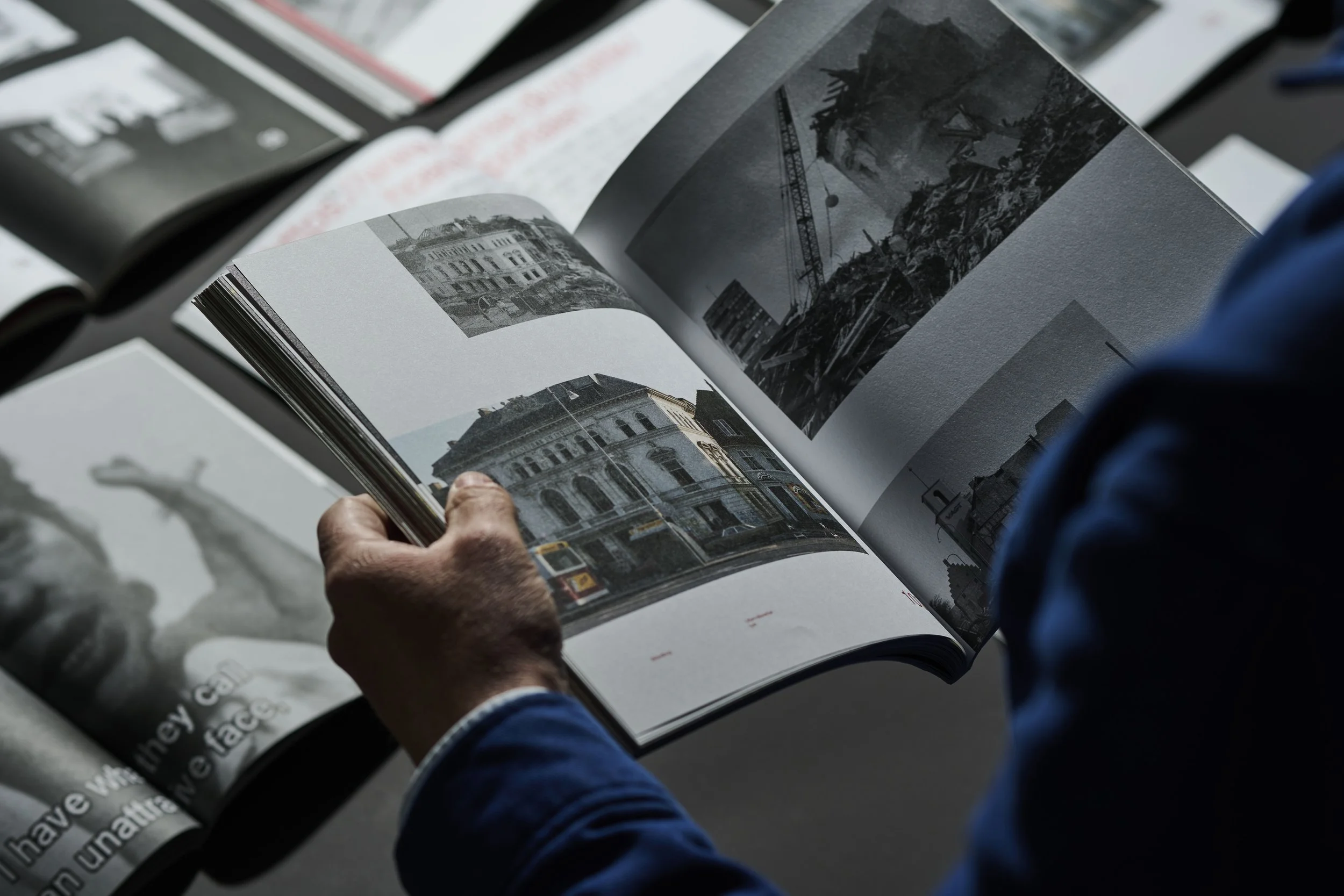
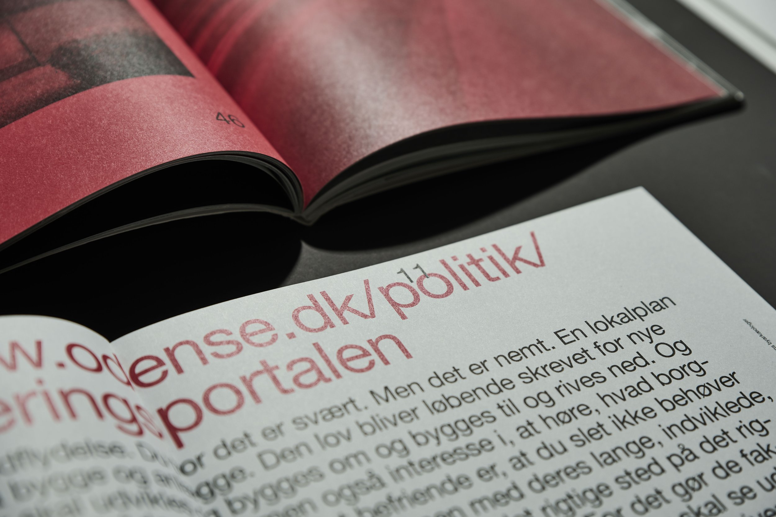
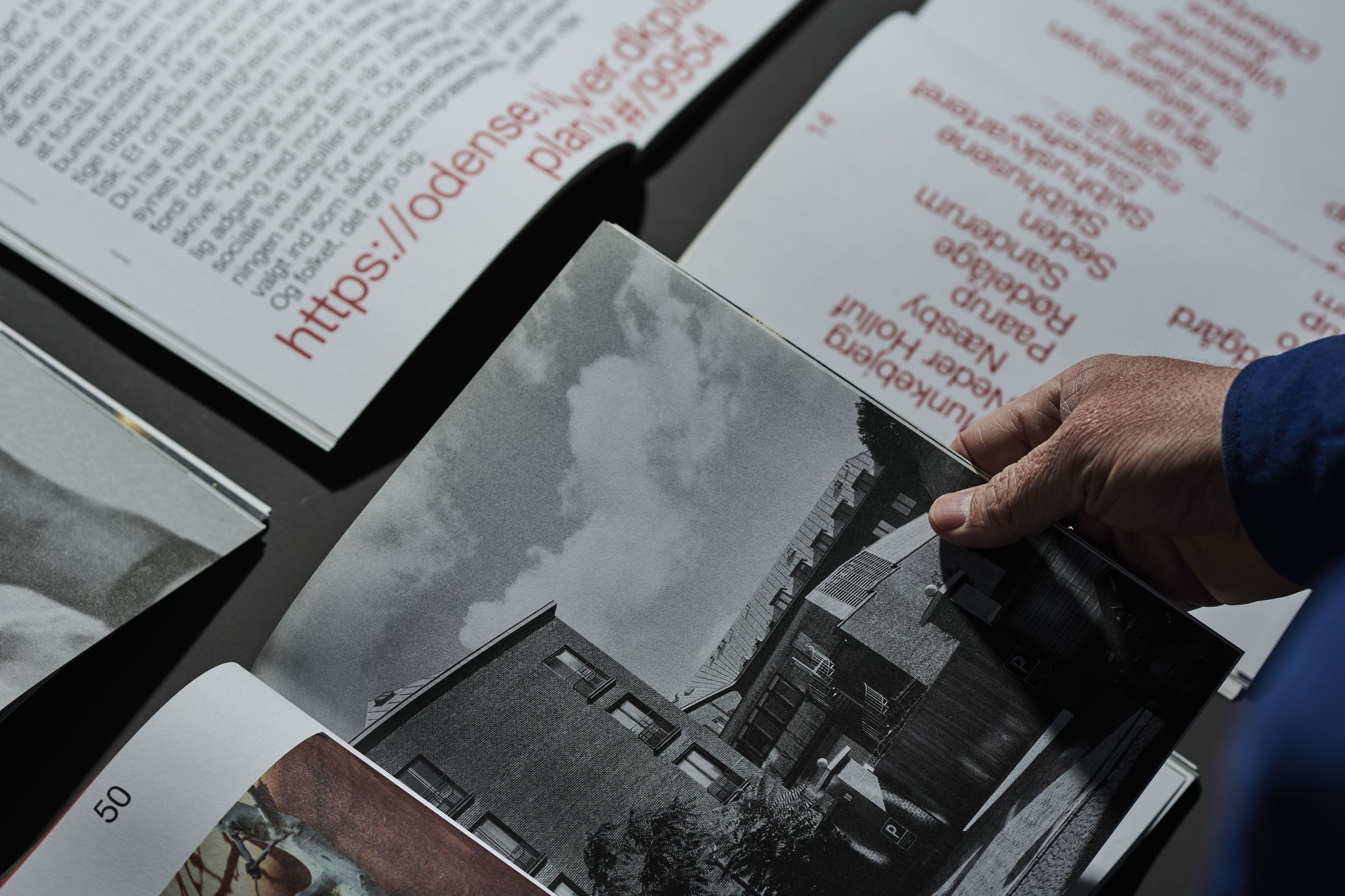
( 2023 ) This book came into being as a lasting document of the two Odense-based architecture festivals that appeared and disappeared again in 2019 and 2020, fleeting, as festivals are by nature. For that reason, an imprint had to be made, also on paper. And so the book became: OAFX, Picture book. A wayfinding system for the city archaeologists of the future. We chose an oversized pagination to echo the childlike association of a picture book. Respect for the images was paramount; they were meant to speak for themselves, so the image spreads were given almost religious amounts of breathing space. For the same reason, the small graphic text lock-up was radically understated, yet rule-breaking in both content and placement. And the most beloved festival quotes were meant to be whispered in the ear, like the secrets of summer, set in 5-point type, only for those who want to take everything in. The few full-length texts were blown up entirely - into a shout. Because what needs to be declared must be declared loudly enough to be heard. “Love Letter to the City” and “Hey, Citizen!” were therefore set in 42-point type.
Editors: Pil Lindgreen & Mira Erik
Photographer: Bobby Mandrup
Print run 500 copies
Printed by Narayana Press
Published by Foreningen Odense Architecture Festival